Redesigning Rodenteye platform
- a case study -
Rodenteye
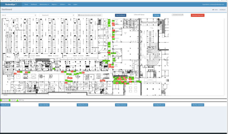
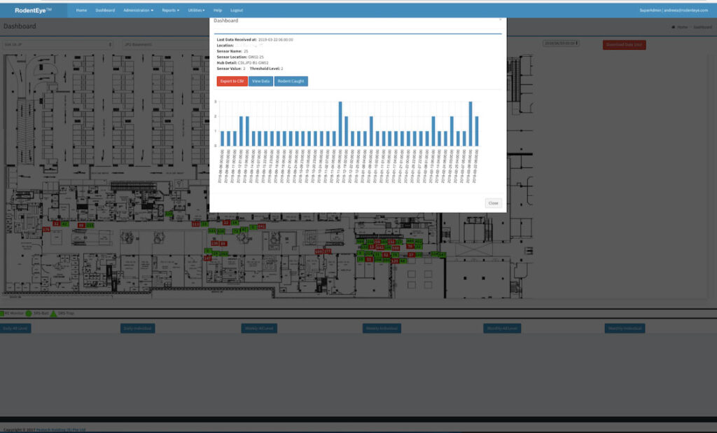
RodentEye is an is an advanced rodent IoT monitoring system commercialized by Pestech Holding (S) Pte Ltd, a tech start-up. It uses data analytics to estimate the number of rodents and their most likely entry points on a site. The system offers an online monitoring dashboard that clients can access 24/7. The system automatically sends SMS when rodent movement is detected. Once a week, the company sends clients detailed reports on rodent monitoring. Fig. 1a) and 1b) depict the current dashboard interface.
However, despite having access to an online monitoring dashboard clients preferred to rely on the weekly reports. This is obviously causing a delay in action compromising rodent prevention and contributing to increased man power costs.
Therefore, in this project I am focusing on understanding the problems faced by customers in using the dashboard and re-designing the RodentEye platform for a better user experience. This report is presented detailed case study describing in details all the steps involved in the design process.
Challenges
Lack of constant monitoring on the customer site has the following consequences:
- it enables rat infestation as no immediate action is taken
- it contributes to an increased man power costs:
- the company gets often blamed the system would not work properly as clients lack knowledge on how to use it. As such cameras, & man power resources has to be deployed to prove it otherwise
- it forces the company to keep sending SMS alarms, e-mails & weekly reports
- it creates frustration as the company invested a lot of resources to develop the platform
Observations &
Interviews
To understand the problems clients are facing, I conducted interviews with two pest controllers and two managers in charge with pest control supervision. I asked them to show us how they use the dashboard and how they perform some common tasks. This method enabled us to observed the following:
- users have to scroll up and down, left and right, to see the entire floor map as the dashboard lacks cross-browser compatibility and responsive design for smaller screens like laptops and mobile phones
- sensor statistics and trends cannot be exported
- there is no feedback for sensors with no data, i.e. clicking on the sensor triggers no effect, i.e. it looks like the system is frozen.
- lack of feature discovery: for ex., sensor battery status or path view are implemented features, but are very hard to find (none of the people interviewed knew about them);
- inconsistent terminology used across the dashboard
- the dashboard contains features meant for admin purposes that customers don’t necessarily need
- there is no dashboard live status available; the dashboard can become unresponsive due to networks connectivity or system maintenance;
While the dashboard has several shortcomings, the clients learned to deal with them: e.g. features they don’t understand are ignored; they react only when mandatory, i.e. when they receive an SMS alarm/email or when a visit to the site is scheduled. If the system cannot be used in the way they need, e.g. to export statistics and trend graphs they find ways to work-around, e.g. by taking screenshots.
During the interview, it became evident that clients use the dashboard UI rather infrequently, i.e. once or twice a month, solely with the purpose of preparing progress reports. For this task, daily/weekly views and chart data are used. For monitoring tasks, SMS& emails are sufficient. When alerts are triggered, clients would simply accompany the pest technician to the location indicated in the SMS/Email.
In short, the clients are reluctant to use the dashboard because:
- they lack time; those in charge with monitoring are usually very busy managers
- SMS & EMAIL alerts seem to be sufficient in fulfilling their needs
- UI is not responsive and therefore not well adapted for laptops or mobile phones which are mostly used for site inspections
- they don’t seem to understand that they have also to play an active role in combating rat infestation.
Solutions
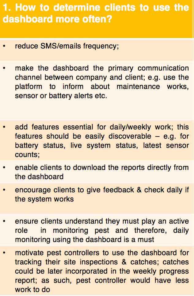
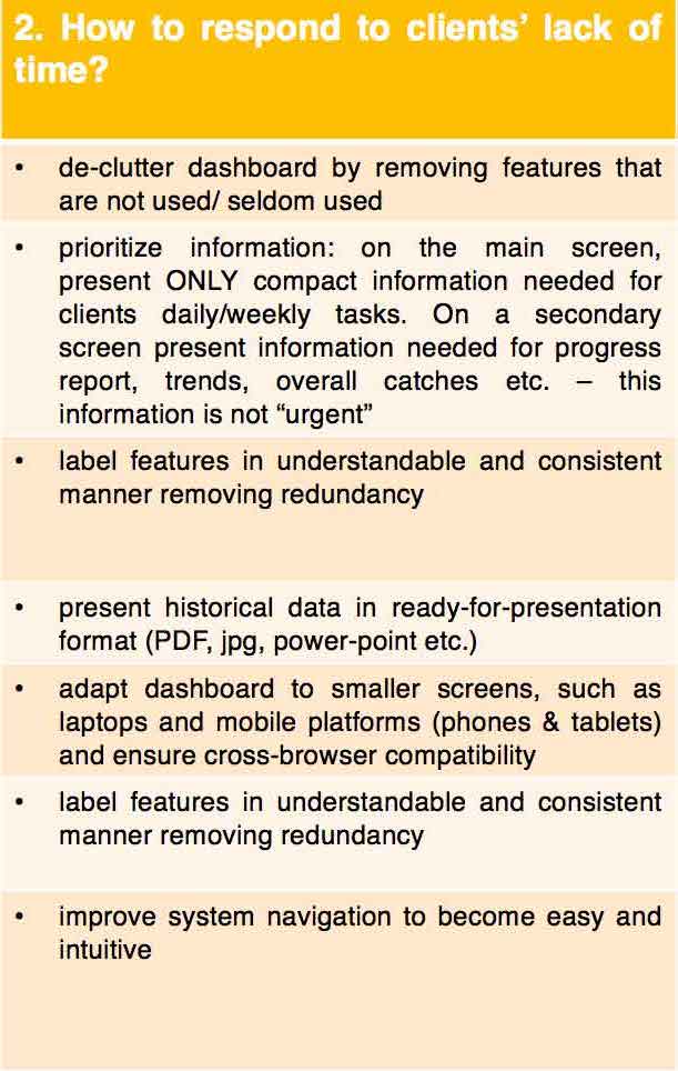
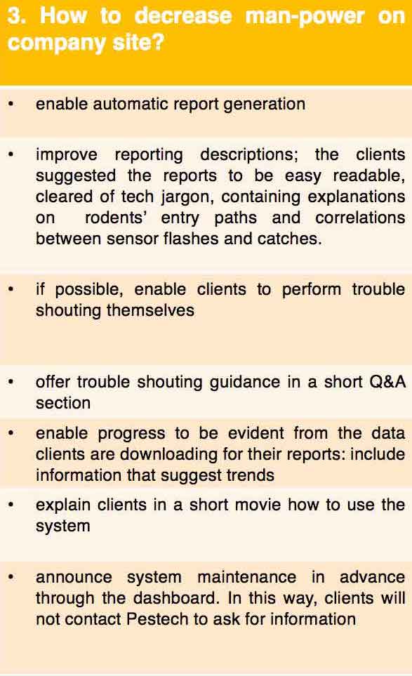
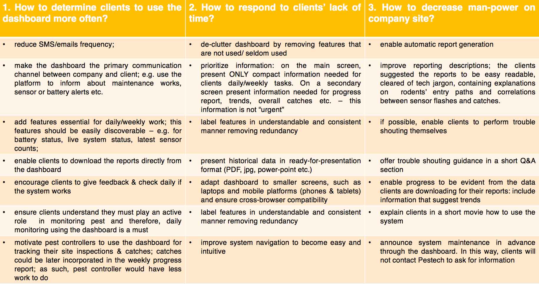
Based on our observations and interviews I come up with several solutions that responds to the observation made earlier. The solutions are depicted in Table 1.
User groups
To improve the overall user experience with a system it is important to understand the difference in usage between different user categories. For RodenEye, the following user groups were identified:
- User type 1: Building/Location owners
- User type 2: Personal in charge of pest control at location side (managers)
- User type 3: Pest Controller Operator
- User type 4: Pestech itself – for overall monitoring & control
- User type 5: National agency for environment (NAE) – for overall monitoring
User type 1: are mostly interested to know if rodents are present on their premises and how sensor triggers correlate with catches. They are interested on seeing the progress over time. They are a subgroup of type 2 & 3
User type 2 & 3: are interested on all details regarding number of triggers, location, time of the trigger. They usually work directly with pest technicians and are the first to get benefits from using the dashboard. They need to report progress, and therefore need access to historical data.
User type 4: Pestech uses the dashboard as an administration tool, upload maps, add sensors, monitors batteries, keeps track of the messages SMS, logs etc.
User type 5: mostly interested on the overview of monitoring pest in Singapore. Not directly involved in field-work & catches.
The clients interviewed belong to user type 2 and 3. Since they are actively working with the system, they are the primary persona. As such, the RodentEye re-design will be focusing on their particular needs as a priority. A typical day for a manage/ pest controller would be as depicted below:
- the controller receives an SMS/Email alarm with sensor location. On the scheduled day (and not earlier!) he will contact the pest technician. Together, they will go to the location indicated in the SMS/Email. Most of the managers/pest controllers know by heart sensor locations, i.e. they don’t need to check the location on the dashboard.
- once the traps are set, the manager keeps track on the catches. He compares the daily sensor triggers with the number catches. Sometimes (but rather seldom!) catches are reported through the dashboard.
- once every 2-3 months he prepares progress reports using the reports received from Pestech and makes screenshots
SITE GOAL
I analyzed carefully the functional and non-functional requirements of the page, as well how they fit to the user groups. Based on this information, I established the overall goal of the dashboard is to monitor and report rodent movements. This goal can be split into the following subsequent functionalities:
- Report sensor triggers (number of counts on the sensor) & significant threshold (green/red colour)
- Provide overview on rat movement with date & time & location (historical view)
- Provide tools to observe the sensor functioning (for ex. battery life)
- Administrative purposes, i.e. add maps, add sensors, add users, monitor logs etc.
Site Structure
Content items can be further are grouped according to their type, such as:
- Transactional: member login/logout
- Dynamic: sensor/trap counts, threshold (red/green), movement direction (path-in/out), system status (maintenance) battery life (percentages),
- Static: sensor/trap location, geographical map, floor map area, help menu, FAQ, symbol legends
- Functional: notifications (i.e. battery level, system maintenance, feedback on data availability); admin information on: organization, user, site; log info on: reports, configuration, sensor& batteries, communication, data view with time category (last update, 24h, 7 days, 30 days, historical data, hour), weekly/monthly reports, test mechanism, downloadable data
Information
Architecture
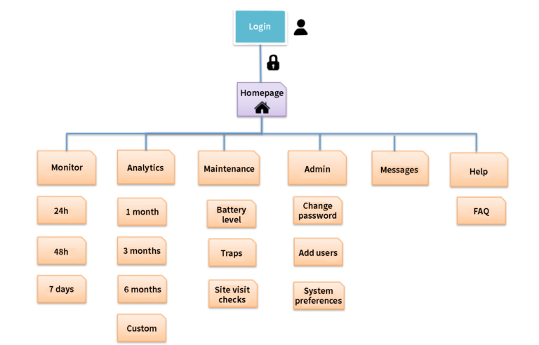
Based on the site content and structure listing, I determined the following information architecture for RodentEye:
- Login page: RodentEye logo, login credentials: user name & password
- Home: Overall view of the sites & floors, SG map location
- Dashboard: Current view sensor + threshold – last 24h, 7days, 30 days, custom time frame – System monitoring / Site monitoring (on the right)
- Analytics: historical data: 2, 3, 4, 6,12 month + archive; download graphs for progress reports
- Site maintenance: battery level, sensors, log weekly site visit (day & time, catches)
- Admin: change password, configure system 9system preferences), add users
- Messages: messenger like platform for notifications: sensor alerts, battery level alters, maintenance work, reminder to check the site, empty traps and add catches): user can take screenshots and feedback, if any
- Help: explicative video of the dashboard, how the system works, FAQ
The architectural blue print is depicted in Fig.2.
Visual Design
Layout grid
The layout grids indicates how the website is going to be structured and where the content is going to be placed. According to architectural blue print, the dashboard will have 6 pages. For quick and easy access to essential information at one glance, I placed on page 1 (Monitor) the following elements: the floor map with sensor triggers, a site monitoring corner displaying the overall sensor counts and a system monitoring corner where critical system info will be shown. For reports, clients can use page 2 (Analytics) where graphs, trends and statistics are placed. Page 3 (Maintenance) will host the maintenance monitoring for sensor batteries and traps while page 4 (Admin) will enable the clients to add users to the system. On page 5, messages between users and Pestech can be sent, as well as files and reports. Page 6 (Help) is reserved for info video and FAQs about the platform.
Navigation
For global navigation, a collapsable navigation bar (Menu) is vertically placed on the left side as shown on fig. 3 series. Menu labels have icons to ensure an easy transition when collapsing. Another horizontal bar is placed on the top to display notifications, (messages), settings (language) and a search bar.
Local navigation is placed horizontally on page 1 (Monitor) and page 2 (Analytics) for sensor counts and respectively statistics. For page 6, questions will be linked to an sub-page where answers will be listed.

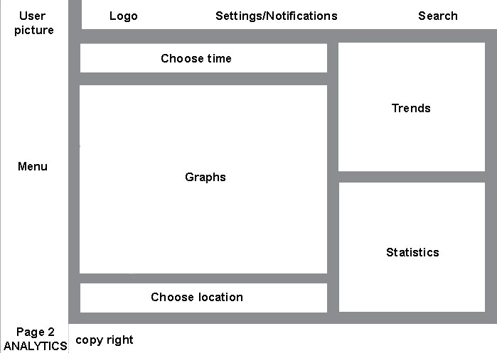
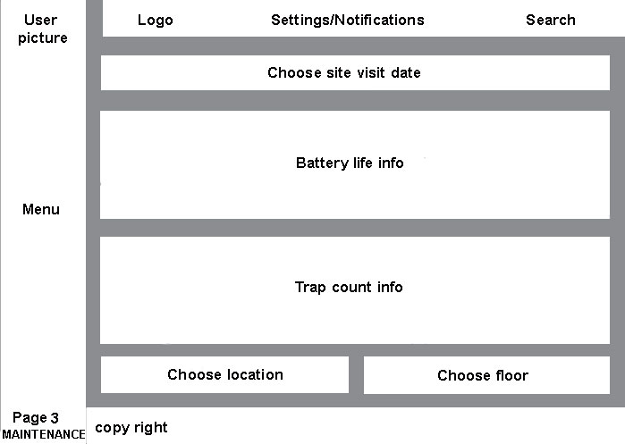
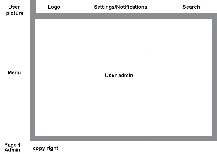
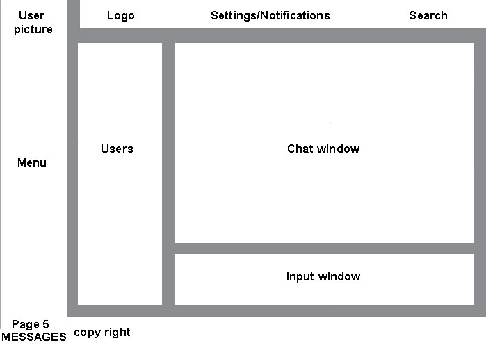
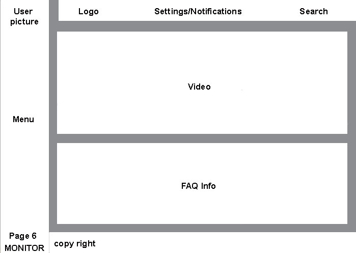
Fig. 3 series – Layout design
Hand sketches
First sketches, I usually do by hand using paper and pencil. I made several drawings and compare alternatives. At this stage, aesthetic and final look are secondary while the focus lies on determining the optimal content display. To do so, I used for the drawings a black pencil and a few colors for contrast as shown in Fig. 4 series. When users click on a sensor/battery/trap element on page 1 and 3, a pop-up window will display additional information.
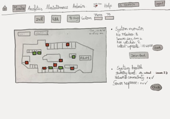
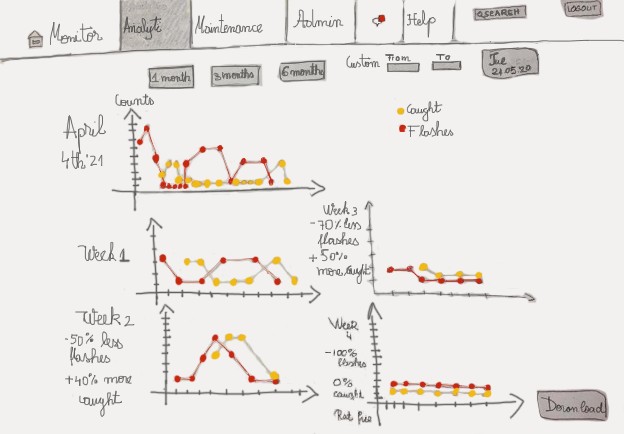
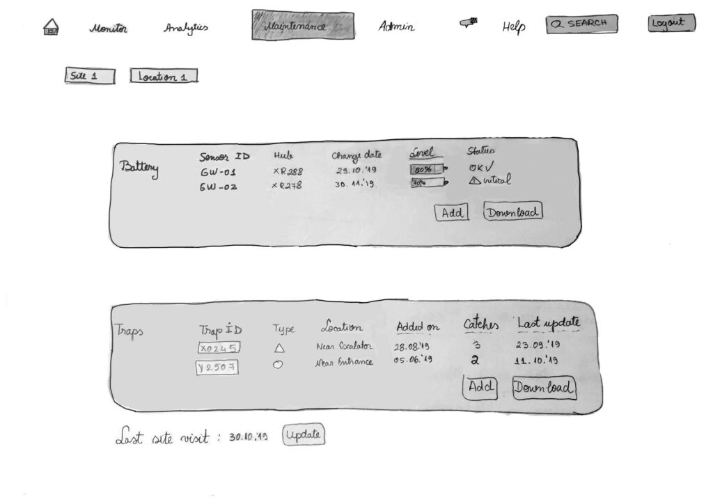
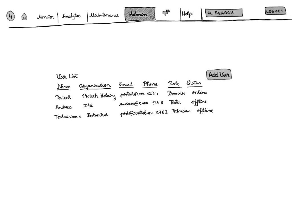
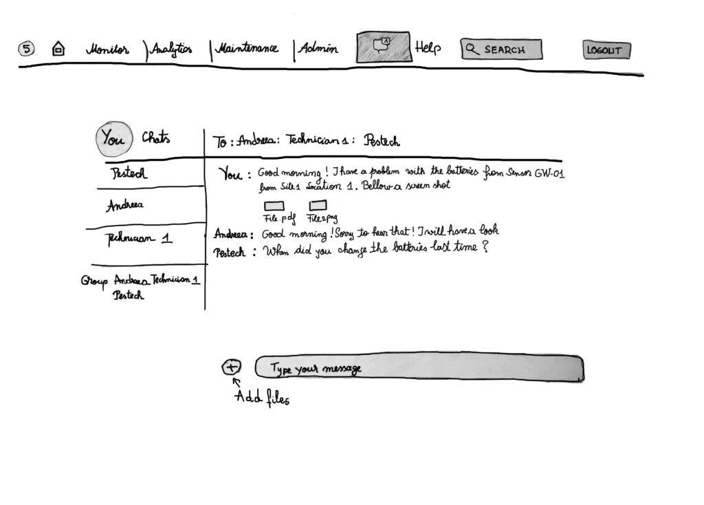
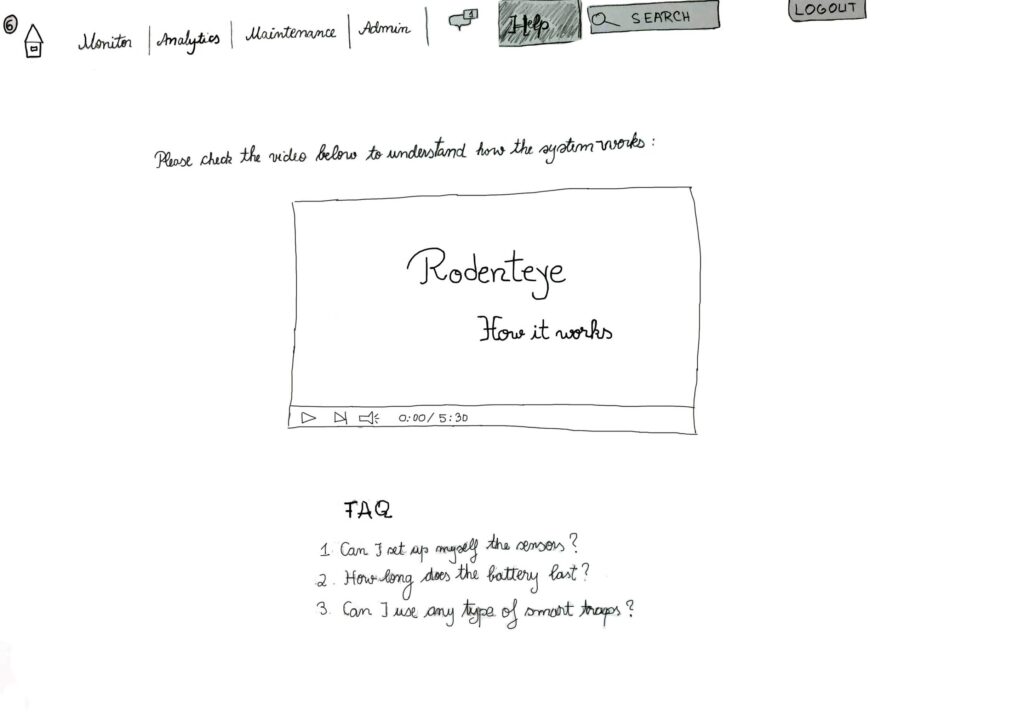
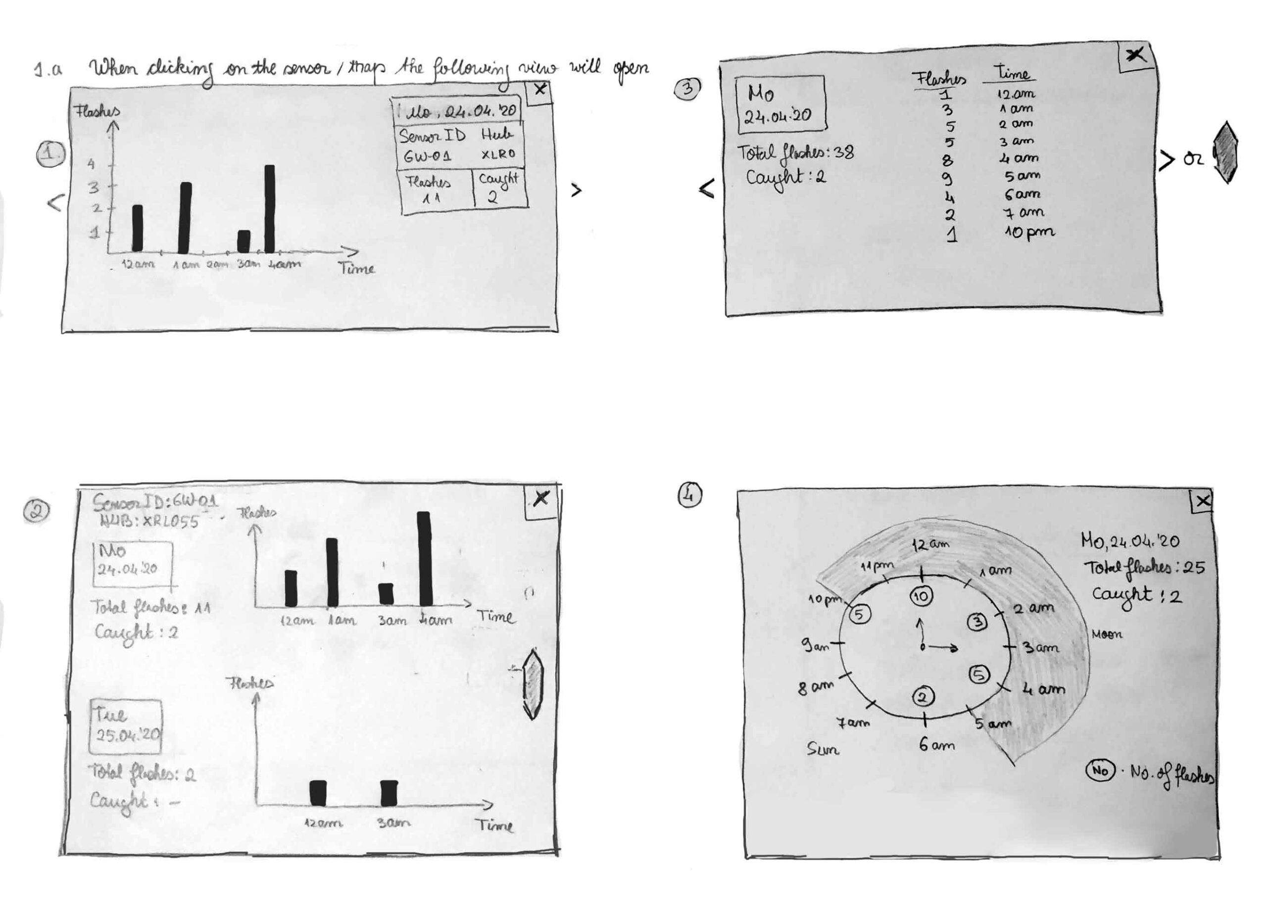
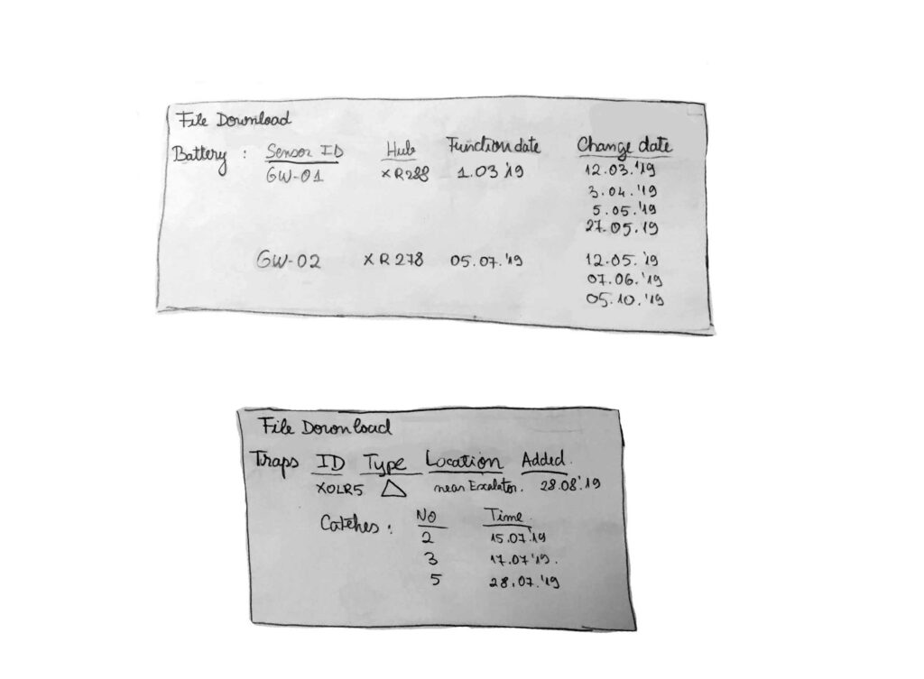
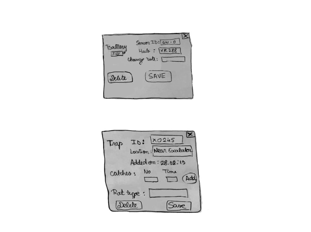
Fig. 4 series – Sketch design
Interactive mock-up
Based on the hand-made drawings, I created the first interactive mock-up pages with Balsamiq (Fig. 5). Balsamiq allows pages to be linked together. It is common at this stage to refine the initial sketches as the prototype gets more conceptualized. The focus lies on the navigation flow between pages.
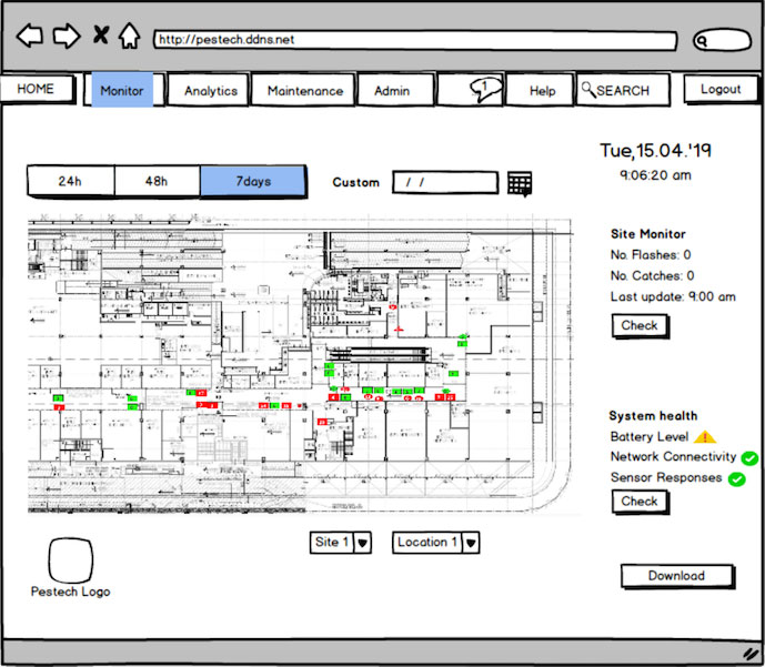
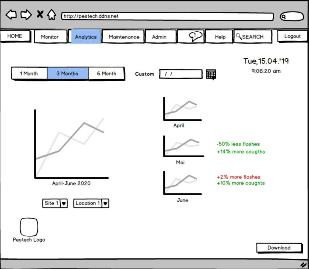
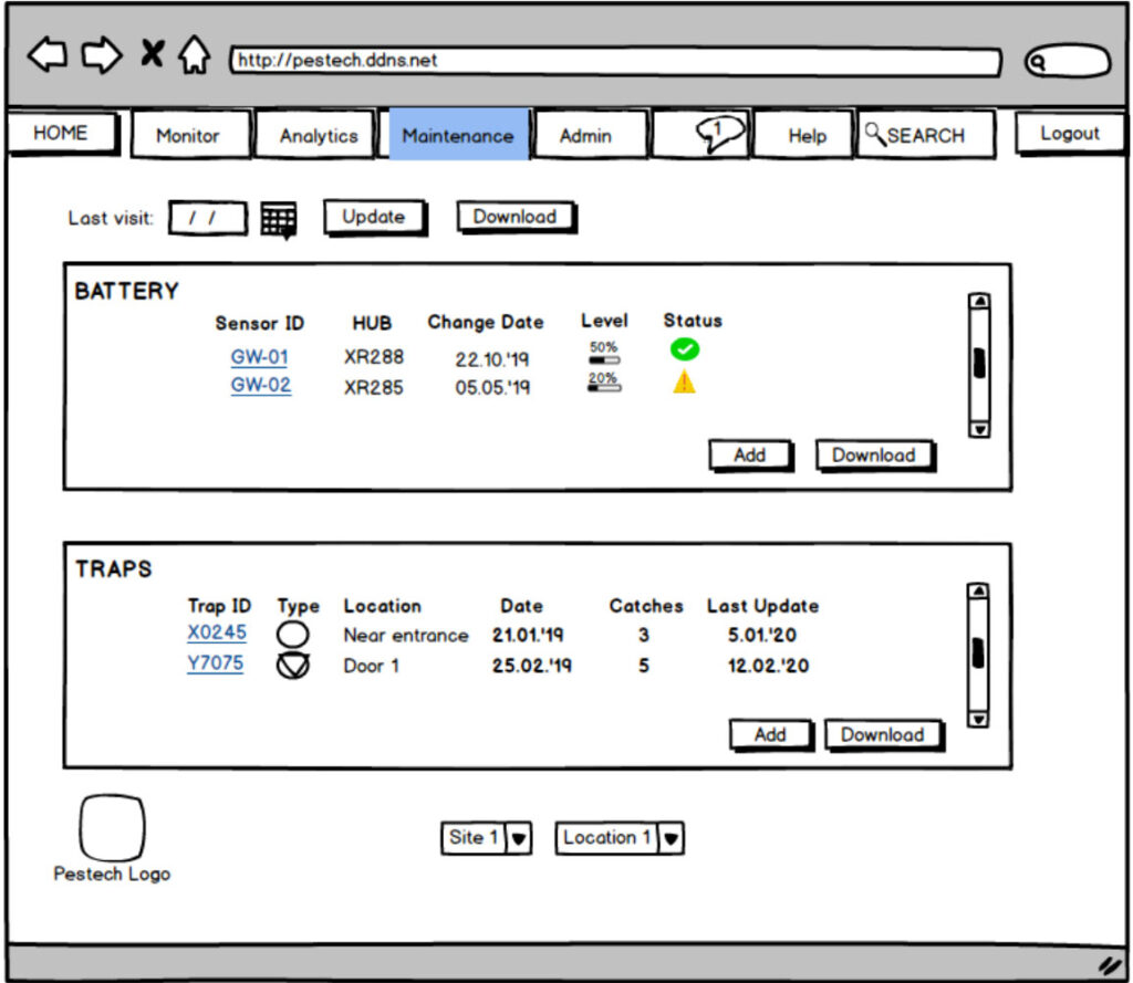
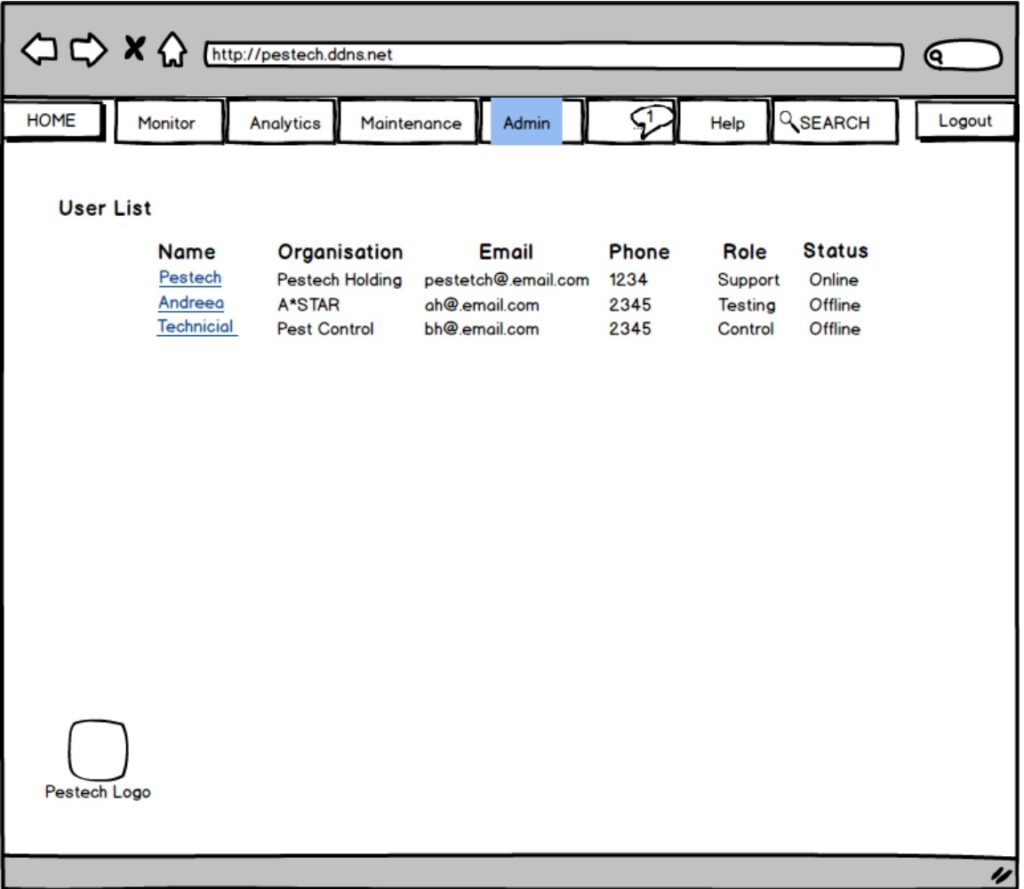
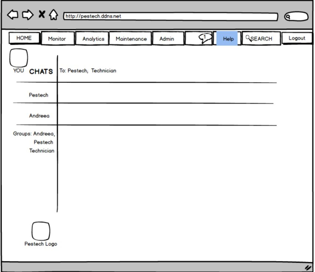
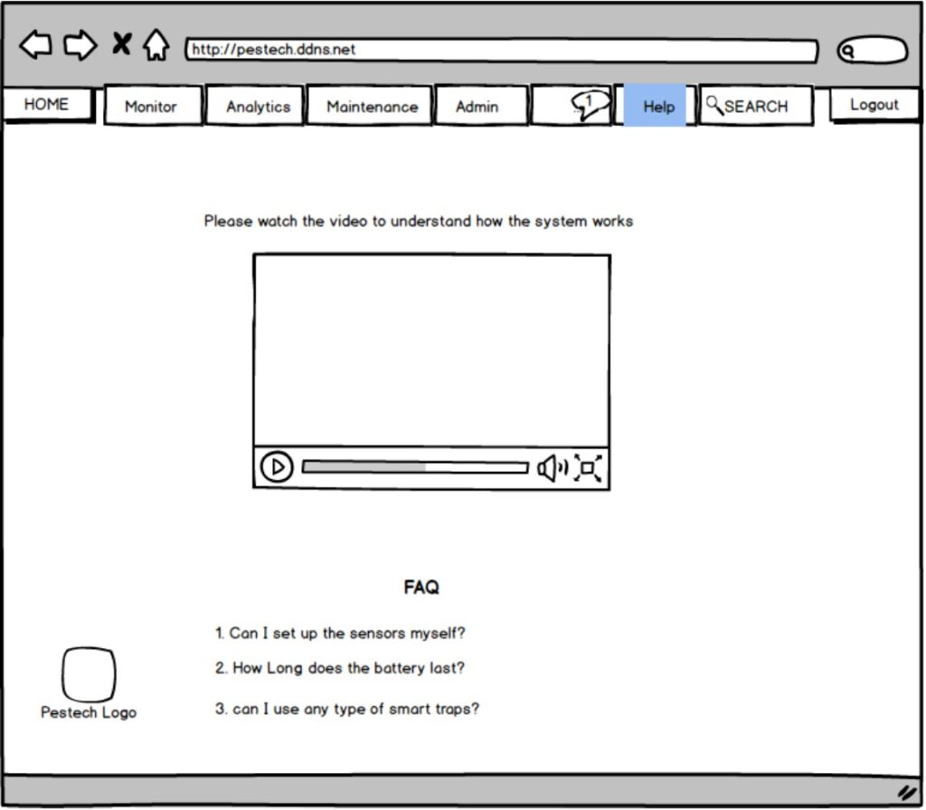
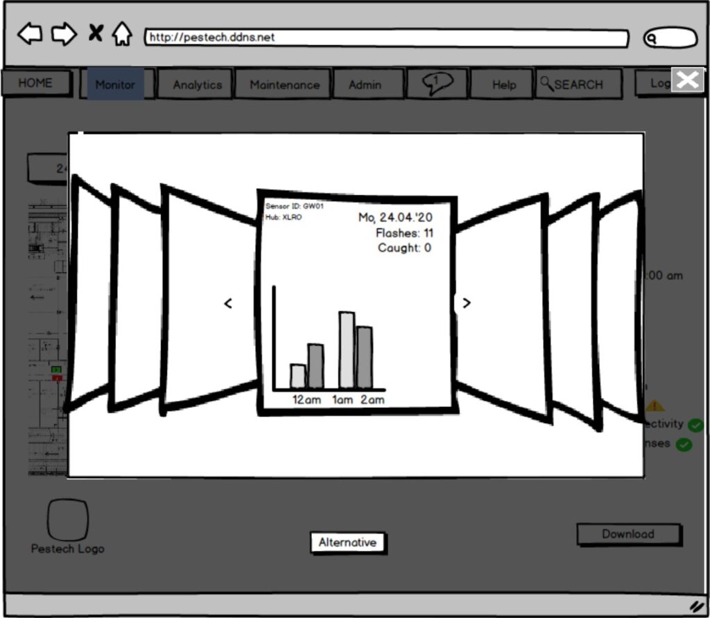
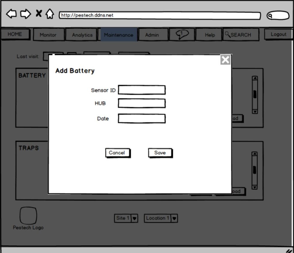
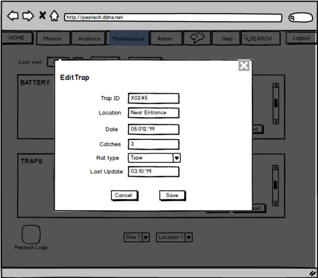
Fig. 5 series – Mock-up design
The final design was elaborated iteratively taking into account all the previous steps mentioned above. To create graphics and icons I used Adobe Photoshop and Illustrator. The pages were further created using Figma. Several minor modifications were performed to achieve a harmonious looking page. The site primary language is English; a Chinese version was also created. For page 6, we elaborated a collection of FAQ examples as well as an explicative video that goes through the pages and explains their functionalities in details. The video is liked below. The site was implemented using Vue.js.
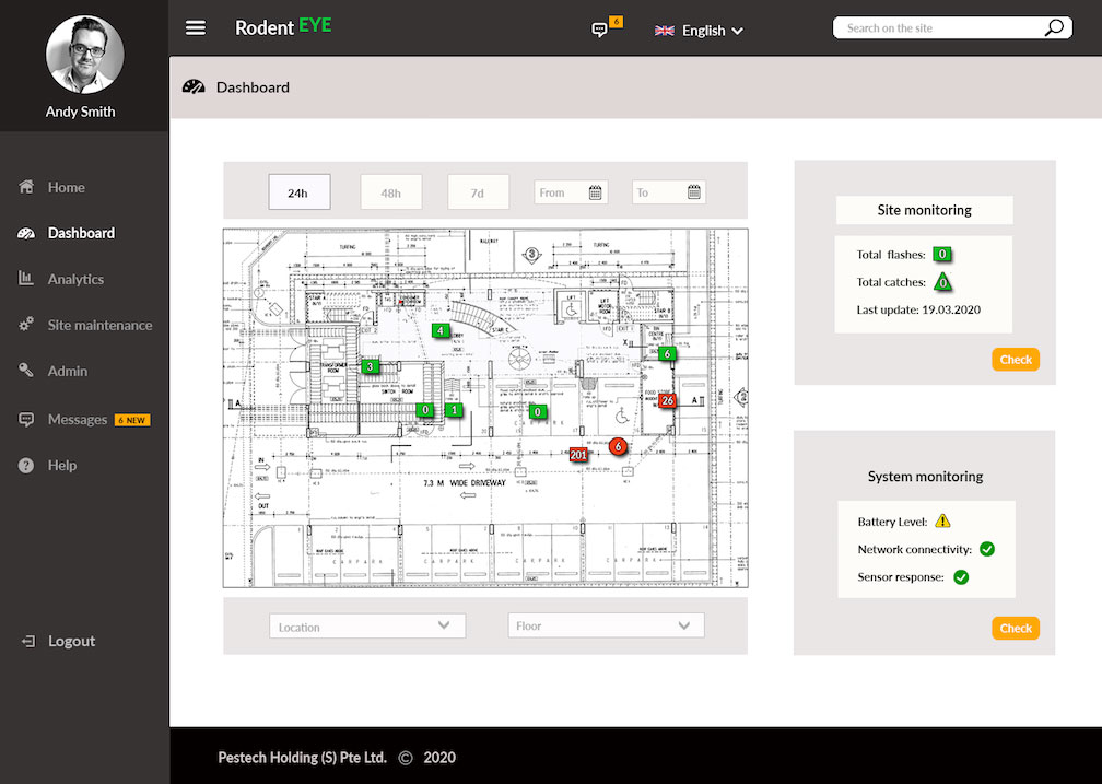
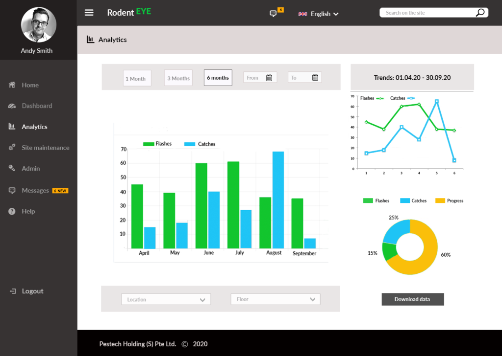
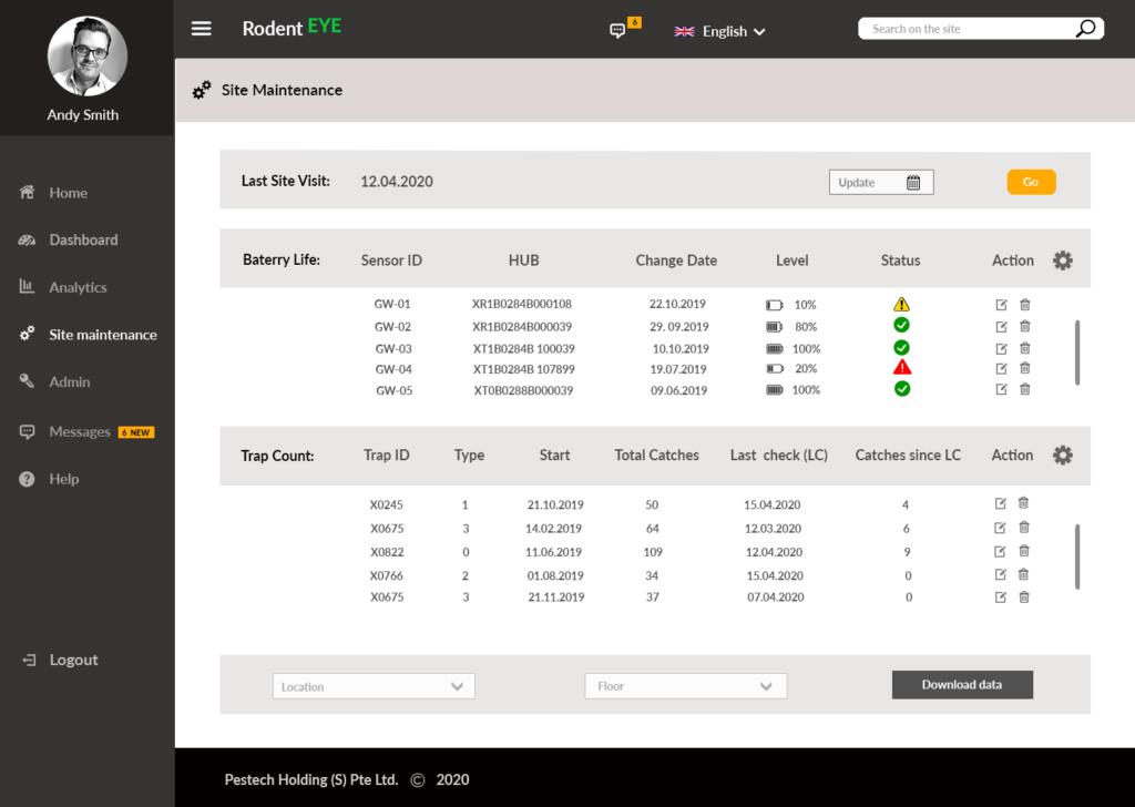
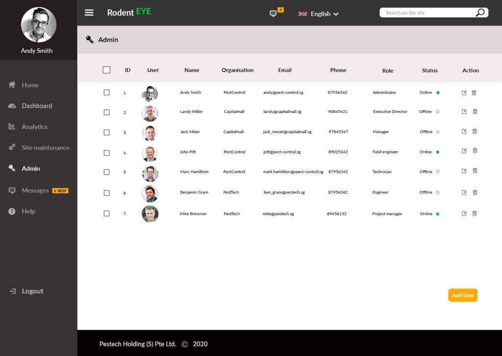
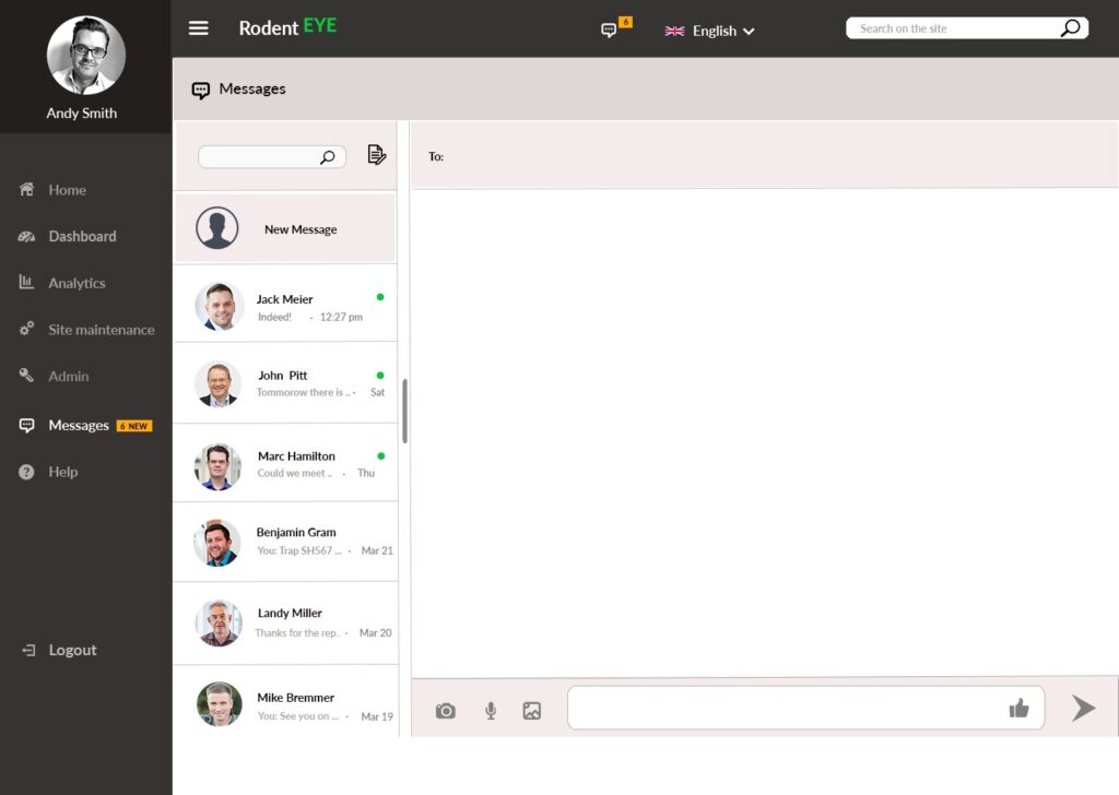
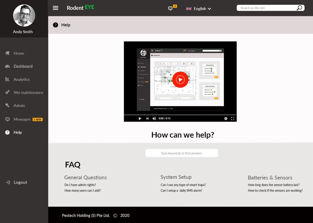
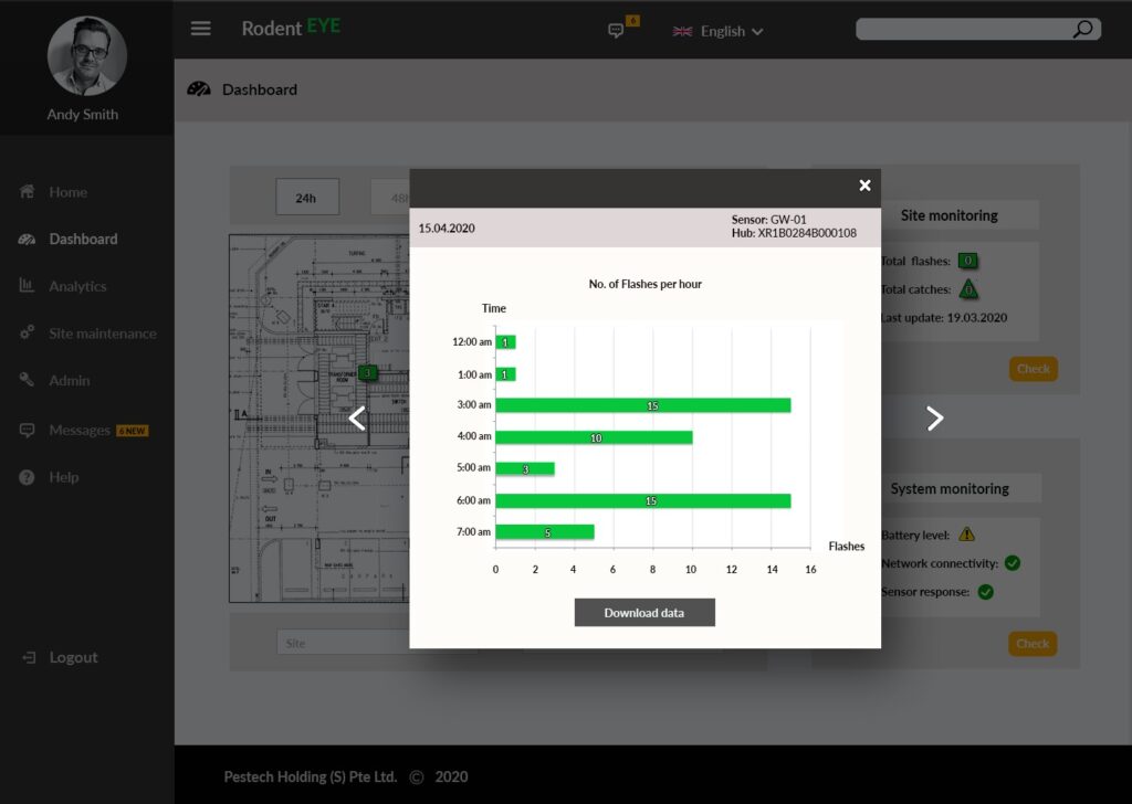
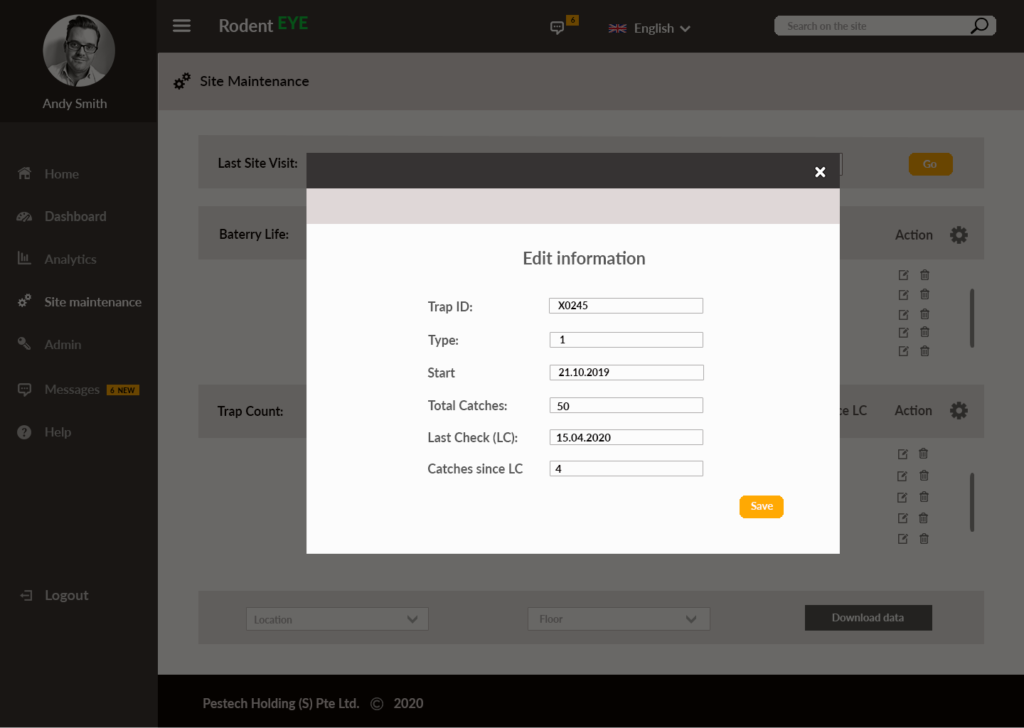
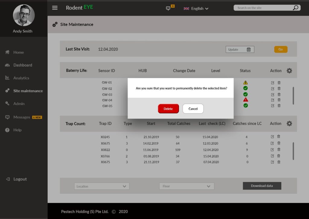
Fig. 6 series – Final design
Vid. 1: Explainer video on how RodentEye App works
Automatic report generation
To implement an automatic report generation, I performed a general task analysis of a manual report generation. I found that this task is based on several other sub-tasks that can be described as follows:
- On a floor, several ‘micro-zones’ are manually clustered to a group
- Screenshots of the floor plants are taken manually
- Comparisons in terms of increase or decrease between sensor counts at different moments in time (current week & past week) are inserted in the reports in form of written text (verbal info) and graphs (visual info)
- Information on rodent removal and rodent direction movement are added. Each information has a location associated with it.
- Screenshots of the floor plants at a given location are also inserted in the report

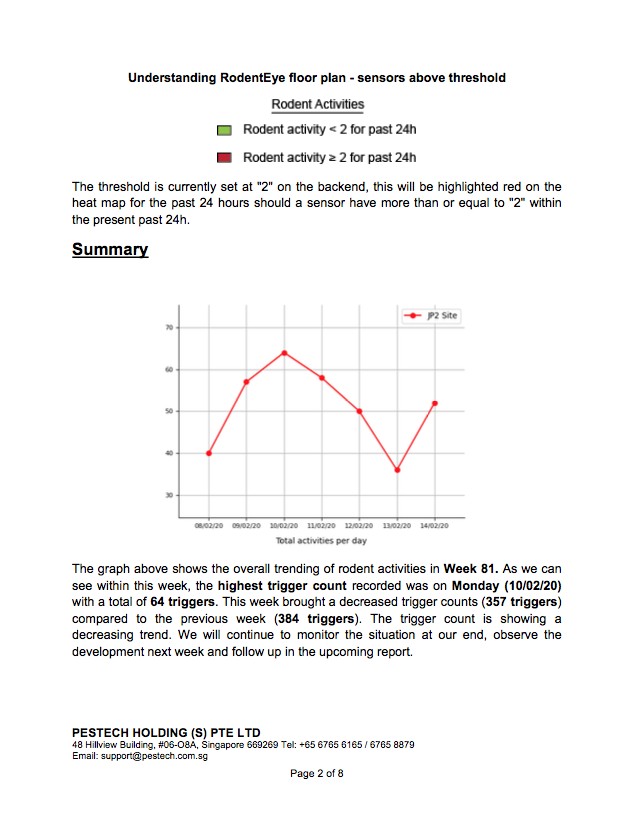
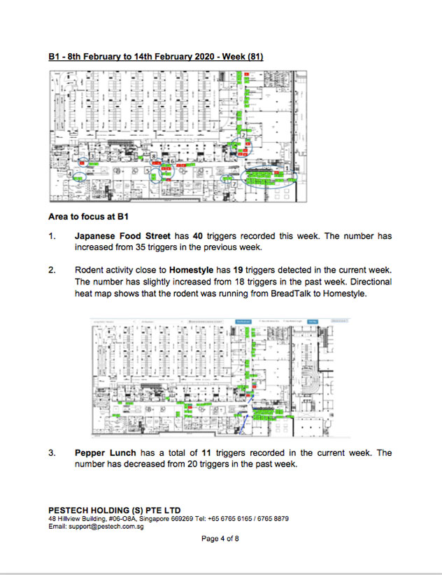
Fig. 7 Automatic report generation in Microsoft
Sub-tasks 3, 4 and 5 can be programmed, i.e. automatically generated given a certain information structured before hands. The structure consists in arranging the sensor count data for previous and current week. The data will be accessed by a python program implemented using specific libraries that will perform the calculation and will return the result embedded into text.
Further, structure includes information on cluster names, rodent removal location, directional movement (from /to unit) as well as floor maps that the program will insert into the report.
Fig 7 shows the first pages of an automatic report generated in Microsoft Word. The automatic report generation will be later uploaded on RodentEye platform and made available to all Pestech clients.
